
Brand Identity
Nelara is a newly formed IT Consulting Services and Technology Management company located in Sweden.
They were interested in a logo, style guide, and other assets. During a series of interviews, I delved into the brand's psyche and honed in on some key principes - trust, transparency, humor, commitment and passion. They wanted me to run wild with concepts, so I let the pixels fly.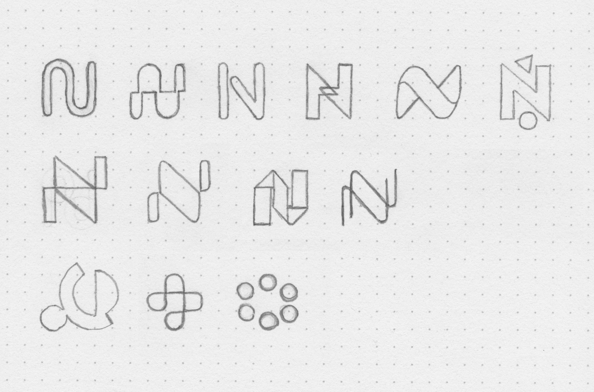
First I began sketching monogram logo concepts. I wanted to create something visually interesting, with an almost op art feel. It also needed to remain "minimal", "bold", and "sharp" - words that came up during our meetings. I explored a few ideas that focused heavily on balancing reciprocal shapes. But I also went wild exploring a plethora of other concepts.
They were interested in a logo, style guide, and other assets. During a series of interviews, I delved into the brand's psyche and honed in on some key principes - trust, transparency, humor, commitment and passion. They wanted me to run wild with concepts, so I let the pixels fly.

Sketching
First I began sketching monogram logo concepts. I wanted to create something visually interesting, with an almost op art feel. It also needed to remain "minimal", "bold", and "sharp" - words that came up during our meetings. I explored a few ideas that focused heavily on balancing reciprocal shapes. But I also went wild exploring a plethora of other concepts.
Digital Doodles
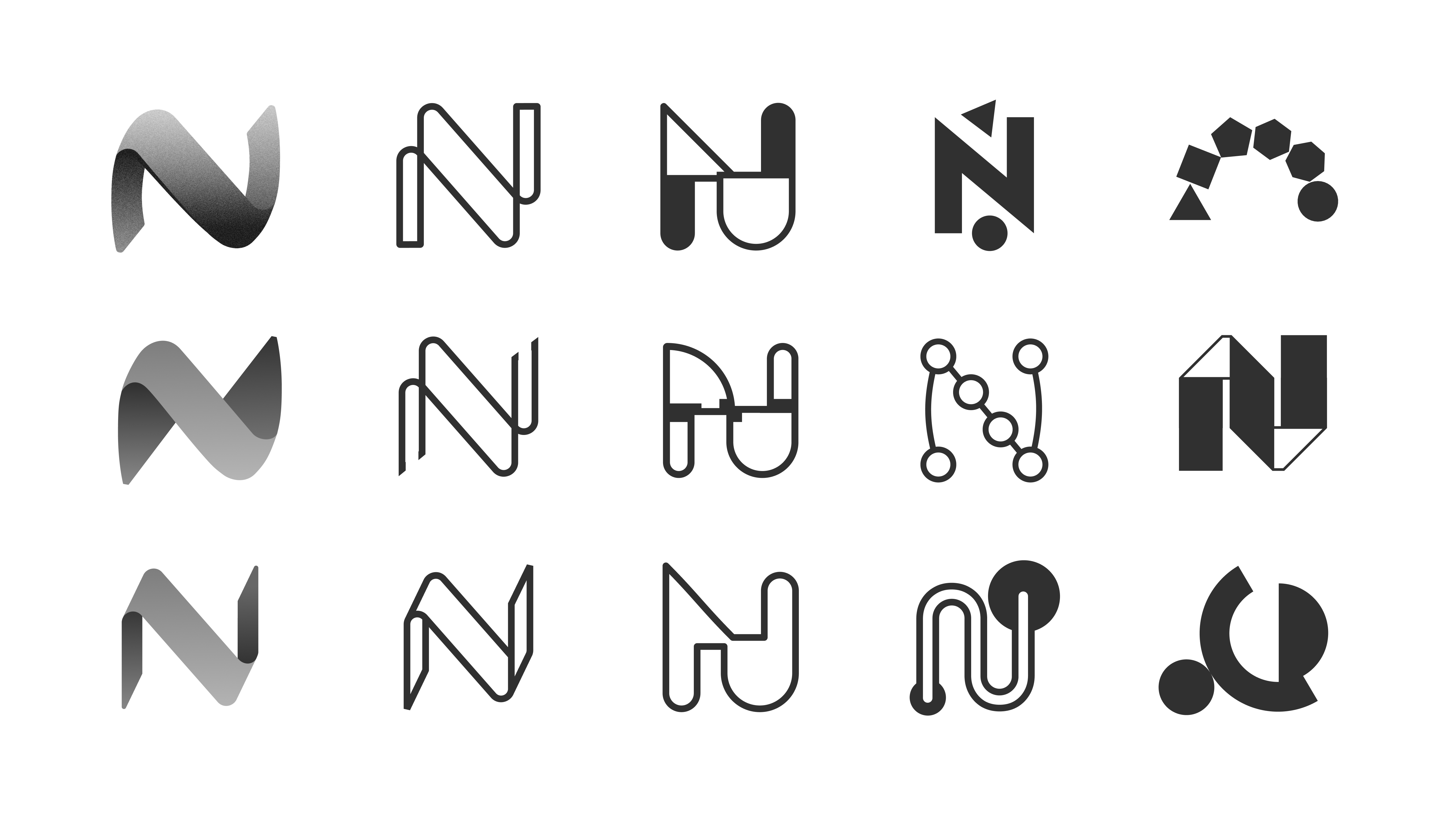
I began to translate these concepts into digital form. I explored contemporary concepts as well as more zany & abstract designs. These concepts rage from stoic to playful, but they predominately focus on the N. The team was excited about this direction and we decided to keep the ideas flowing until we had a eureka moment.

Symbolism
I wanted to revisit one of the abstract concepts. The company's name is actually an acronym of the founder’s 6 family member's names, so I thought it could be interesting to represent each family member symbolically within the logo. This led to a series of design iterations featuring a 6 shape concept. While enticing, this concept was ultimately not chosen.

Morphology
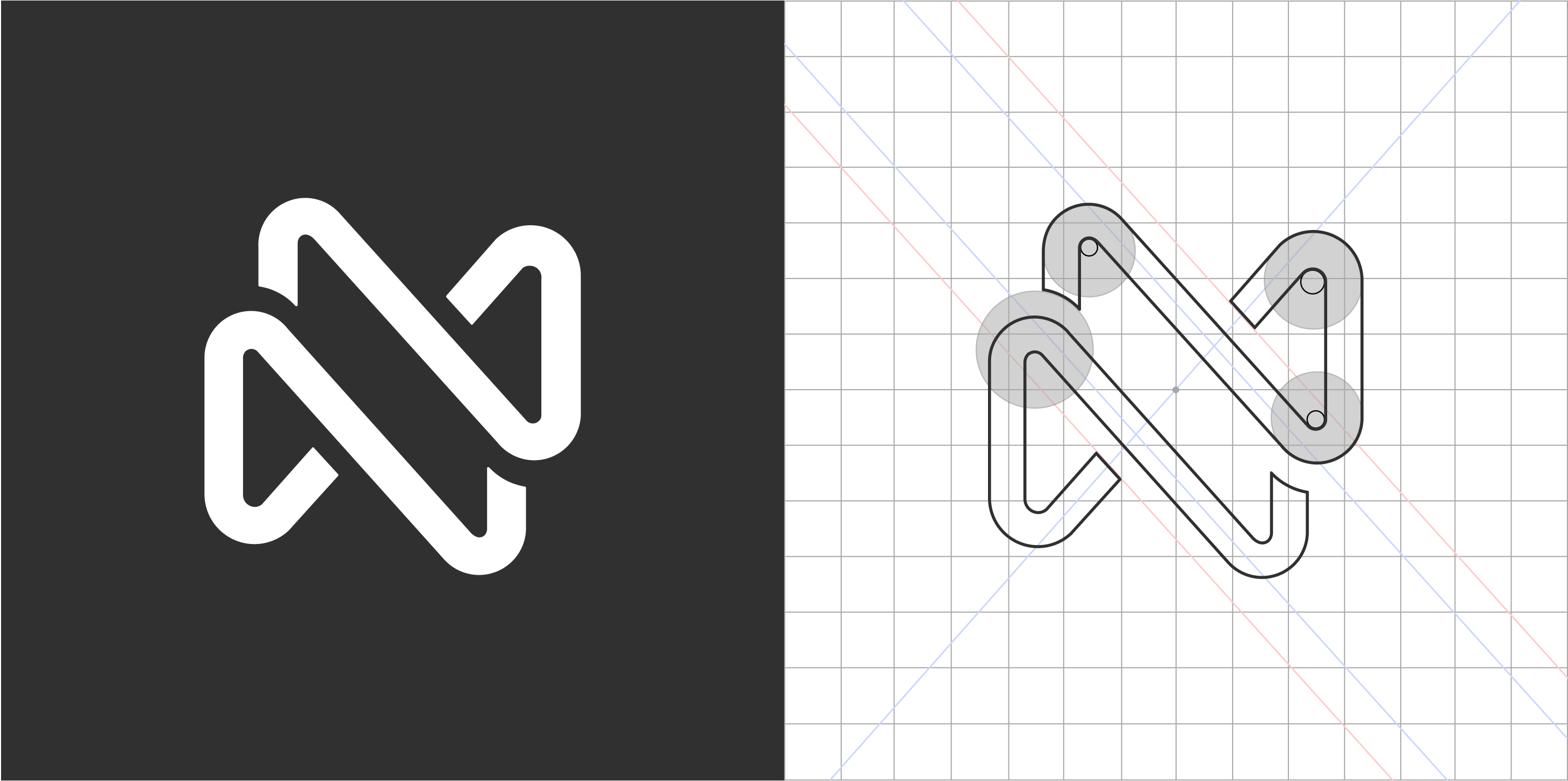
The dots were a close contender, but the team consensus was that the N was the strongest, so I began morphing it into the final design seen below.
Final logo design
Two shapes, placed in recipriocal harmony, that evoke a kind of handshake emphasizing the importance of symbiotic partnerships.

The company name font Josefin Sans, seen here in combination with the logo mark.
3D Model
The client mentioned he had some interest in a 3D model due to his experience working with WebGL and 3D graphics. We talked possiblity of using threejs to display this 3D model on a future website. I created this model with Blender 2.8.
Other Assets
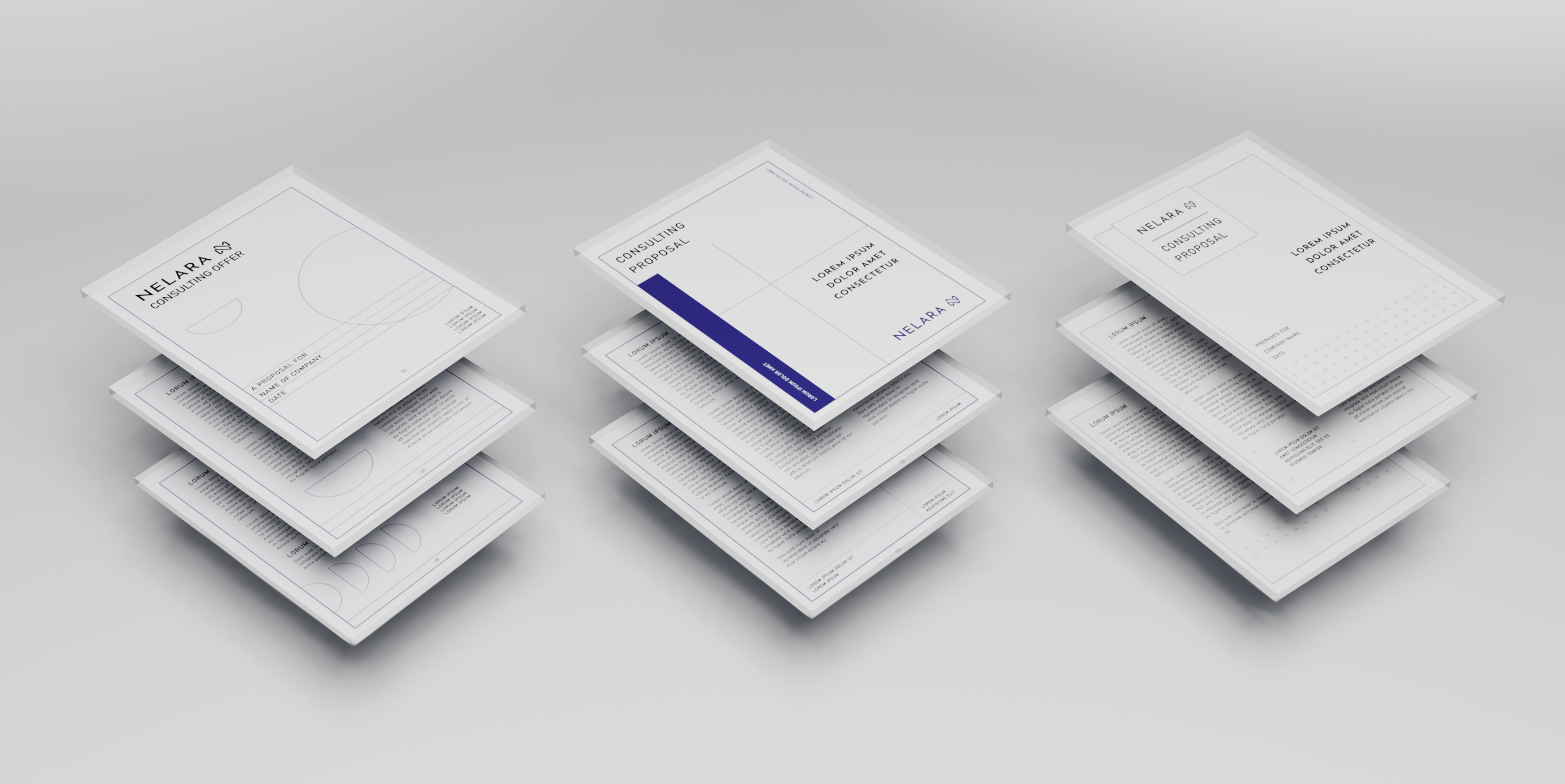
I made other assets as well. A style guide, swag mockups, and various document templates.